Best Collections of Free Responsive HTML5 Frameworks 2015.
 Demo / Download
HTML5 Boilerplate helps you build fast, robust, and adaptable web apps or sites. A lean, mobile-friendly HTML template; optimized Google Analytics snippet; placeholder touch-device icon; and docs covering dozens of extra tips and tricks. Includes Normalize.css - a modern, HTML5-ready alternative to CSS resets — and further base styles, helpers, media queries, and print styles.
 Demo / Download
 Demo / Download
SproutCore is an open-source framework for building blazingly fast, innovative user experiences on the web.
 Demo / Download
Foundation is the most advanced responsive front-end framework in the world. Users will feel the speed. Interchange now enables HTML partials for device specific content. Smoother animations and transitions happen with hardware acceleration. The default styles are all updated.
 Demo / Download
Gumby 2 is built with the power of Sass. Sass is a powerful CSS preprocessor which allows us to develop Gumby itself with much more speed and gives you new tools to quickly customize and build on top of the Gumby Framework.
 Demo / Download
Skeleton is a dead simple, responsive boilerplate. Skeleton only styles a handful of standard HTML elements and includes a grid, but that's often more than enough to get started. The grid is a 12-column fluid grid with a max width of 960px, that shrinks with the browser/device at smaller sizes. The max width can be changed with one line of CSS and all columns will resize accordingly. The syntax is simple and it makes coding responsive much easier.
 Demo / Download
Pure.CSS is a set of small, responsive CSS modules that you can use in every web project. Pure is ridiculously tiny. The entire set of modules clocks in at 4.0KB* minified and gzipped. Crafted with mobile devices in mind, it was important to us to keep our file sizes small, and every line of CSS was carefully considered.
 Demo / Download
Base is a semantic, lightweight and extensible framework to power the next generation of responsive websites. An entirely semantic, responsive grid powerhouse. Create fluid and fixed grids with your own widths, columns, gutters, offsets and padding. Built on beautiful, configurable LESS CSS engineered around a set of variables and mixins. Base is ready to transform into any site you throw at it.
 Demo / Download
Bootstrap is a Sleek, intuitive, and powerful front-end framework for faster and easier web development. A 12-column responsive grid, dozens of components, JavaScript plugins, typography, form controls, and even a web-based Customizer to make Bootstrap your own.
 Demo / Download
Layers CSS is a Lightweight, Unobtrusive, Style-agnostic. Build your look on the web, not Twitter's and build it fluid. Layers CSS is a CSS framework aimed for practical use cases. It comes with a small footprint and zero bullshit.
HTML5 Boilerplate
Demo / DownloadHTML5 Boilerplate helps you build fast, robust, and adaptable web apps or sites. A lean, mobile-friendly HTML template; optimized Google Analytics snippet; placeholder touch-device icon; and docs covering dozens of extra tips and tricks. Includes Normalize.css - a modern, HTML5-ready alternative to CSS resets — and further base styles, helpers, media queries, and print styles.
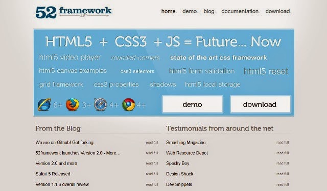
52Framework
Demo / DownloadSproutCore
Demo / DownloadSproutCore is an open-source framework for building blazingly fast, innovative user experiences on the web.
Foundation
Demo / DownloadFoundation is the most advanced responsive front-end framework in the world. Users will feel the speed. Interchange now enables HTML partials for device specific content. Smoother animations and transitions happen with hardware acceleration. The default styles are all updated.
Gumby Framework
Demo / DownloadGumby 2 is built with the power of Sass. Sass is a powerful CSS preprocessor which allows us to develop Gumby itself with much more speed and gives you new tools to quickly customize and build on top of the Gumby Framework.
Skeleton
Demo / DownloadSkeleton is a dead simple, responsive boilerplate. Skeleton only styles a handful of standard HTML elements and includes a grid, but that's often more than enough to get started. The grid is a 12-column fluid grid with a max width of 960px, that shrinks with the browser/device at smaller sizes. The max width can be changed with one line of CSS and all columns will resize accordingly. The syntax is simple and it makes coding responsive much easier.
Pure.CSS
Demo / DownloadPure.CSS is a set of small, responsive CSS modules that you can use in every web project. Pure is ridiculously tiny. The entire set of modules clocks in at 4.0KB* minified and gzipped. Crafted with mobile devices in mind, it was important to us to keep our file sizes small, and every line of CSS was carefully considered.
Base
Demo / DownloadBase is a semantic, lightweight and extensible framework to power the next generation of responsive websites. An entirely semantic, responsive grid powerhouse. Create fluid and fixed grids with your own widths, columns, gutters, offsets and padding. Built on beautiful, configurable LESS CSS engineered around a set of variables and mixins. Base is ready to transform into any site you throw at it.
Bootstrap
Demo / DownloadBootstrap is a Sleek, intuitive, and powerful front-end framework for faster and easier web development. A 12-column responsive grid, dozens of components, JavaScript plugins, typography, form controls, and even a web-based Customizer to make Bootstrap your own.
Layers CSS
Demo / DownloadLayers CSS is a Lightweight, Unobtrusive, Style-agnostic. Build your look on the web, not Twitter's and build it fluid. Layers CSS is a CSS framework aimed for practical use cases. It comes with a small footprint and zero bullshit.
Comments
Post a Comment